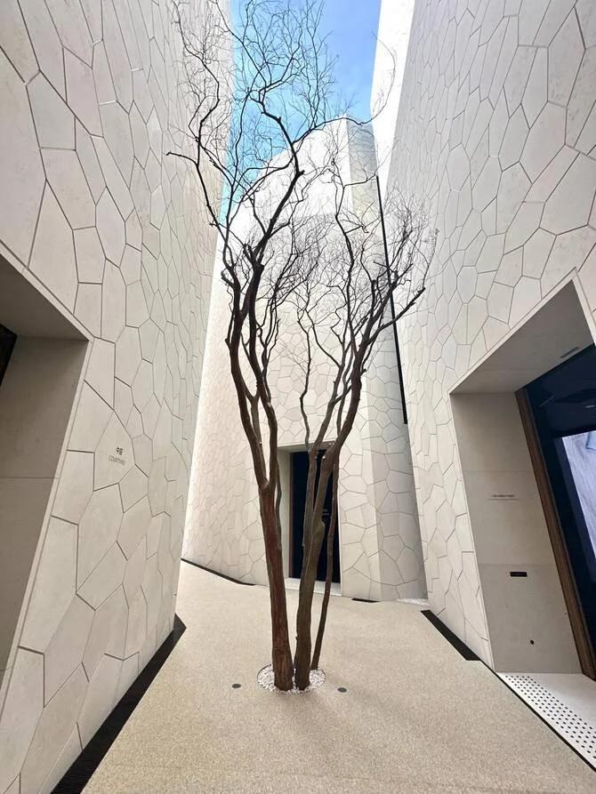
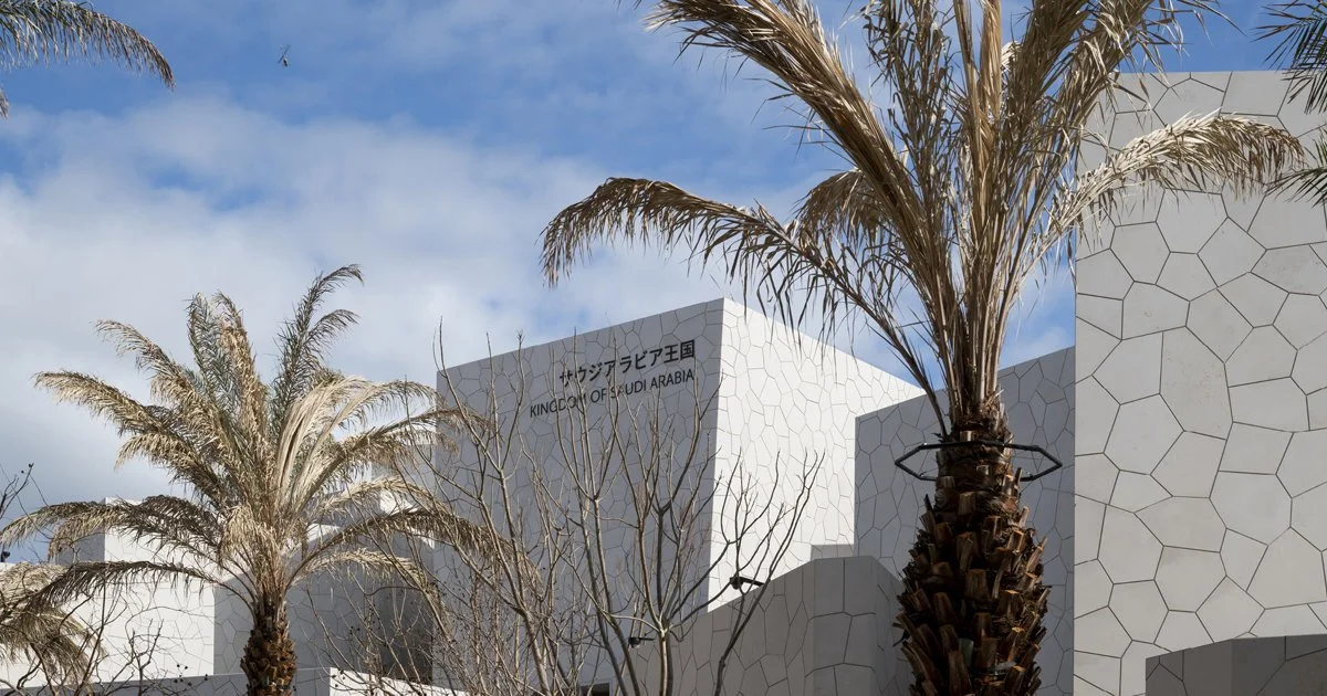
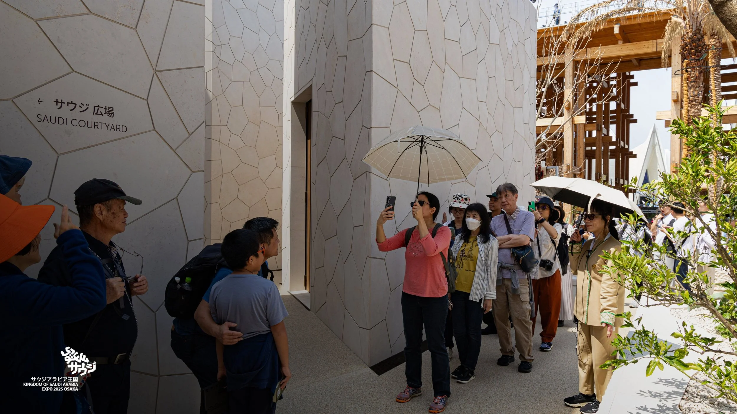
The pavilion for the Kingdom of Saudia Arabia at the Osaka 2025 World Expo, designed by Foster + Partners and located on the Yumeshima waterfront, immerses the visitors in an environment echoing the intricate city centers of Saudi towns.
We created a wayfinding system of both static and digital elements, completely integrated in the architecture, and which echoes the Saudi traditions of stone carving and typography. The results are simply stunning. The carefully positioned carved information panels, with lettering backfilled in dark bronze colour to ensure legibility and compliance with the Expo’s strict accessibility rules, augment the architectural intent, by subtly providing directional clues and underlying the pavilion features.
The project posed a number of challanges, both in terms of compliance with the Expo guidelines during the design stage, and with construction - as each signage piece was unique. The very successful outcome was the result of an amazing team effort, and close supervision through all stages of the project.
Key Features of the KSA Pavilion Wayfinding System
Cultural & Architectural Integration
Designed to echo traditional Saudi stone carving, blending heritage with modernity.
Fully embedded in the pavilion’s architecture, ensuring a cohesive visitor experience.
High-Legibility Typography & Accessibility Compliance
Custom bronze-inlaid lettering for maximum contrast and readability.
Strict adherence to Expo 2025 accessibility guidelines, ensuring inclusivity.
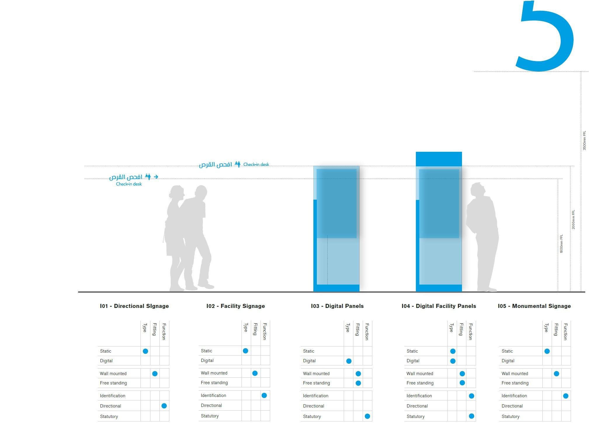
Static & Digital Wayfinding Solutions
Hand-carved information panels with directional cues that enhance the pavilion’s design.
Integrated digital displays for dynamic, real-time navigation support.
Overcoming Unique Challenges
Each signage piece was custom-made, requiring meticulous craftsmanship.
Close collaboration with architects to ensure compliance with Expo design regulations.
Why This Project Stands Out
Aesthetic & Functional Harmony: The wayfinding system enhances the pavilion’s storytelling while guiding visitors effortlessly.
Respect for Tradition: The design pays homage to Saudi Arabia’s cultural heritage through material and typographic choices.
Precision Engineering: Every element was individually crafted and installed under tight project timelines.
Project Success: A Collaborative Effort
The success of this project was the result of close supervision, teamwork, and innovation—from initial design to final installation.
Introduction:
The Aga Khan Centre in London, designed by Pritzker Prize-winning firm Maki and Associates, is a striking 10,000 sqm space blending offices, lecture halls, a library, and retail, interconnected by terraces, gardens, and courtyards. Bright Dot Design was entrusted with developing a comprehensive wayfinding and signage system that harmonizes with the building’s meticulous architecture while ensuring intuitive navigation.
Key Features of the Wayfinding & Branding System
Holistic Design Integration
Achieved full consistency across all signage—from directional to statutory, even including art captions and desk tags.
Reflected Maki and Associates’ precision through material transparency and subtle patterning.
User-Centric Navigation Strategy
Minimized visual clutter by reducing redundant signage while maintaining clarity.
Developed intuitive naming conventions for rooms and communal spaces.
Custom Typography & Iconography
Designed a bespoke graphic language, including fonts, typographic rules, and custom pictograms.
Ensured legibility and alignment with the building’s minimalist aesthetic.
External Branding & Signage
Created logo manifestations on the building envelope for cohesive external identity.
Designed external directional signage to guide visitors seamlessly from entry points.
Why This Project Stands Out
Architectural Symbiosis: Signage blends effortlessly with the building’s design, reinforcing its Japanese-inspired minimalism.
Strategic Efficiency: A data-driven approach reduced unnecessary signage while improving navigation.
Attention to Detail: Every element—from art labels to door plaques—was crafted for consistency.
Challenges & Solutions
Complex User Needs: Catered to diverse audiences (staff, students, visitors) with a unified yet flexible system.
Material Innovation: Used translucent materials and subtle patterns to complement the architecture.
The Global City is Vietnam’s most modern mixed-use development of approximately 1.9m sqm, comprising a mixture of low and high-rise luxury residential, luxury villas and a retail shopping mall, designed by Foster+Partners Architects. The development also includes an administrative centre and various schools and public buildings.
Owning the prime location (or called "the crown jewel" of Ho Chi Minh City) at An Phu ward, Thu Duc city, The Global City is served by expressways, arterial roads and metro lines.
We delivered a comprehensive wayfinding strategy covering pedestrian and cycling networks across the whole development, and for the different building typologies as per the project scope. This included directional and identification information in public outdoor areas and links to private and public transport facilities.
Revolutionizing Navigation: Wayfinding System for Saudi Arabia’s New International Airport
Introduction:
As part of an international multi-disciplinary team, our top global architectural firm was entrusted with designing a state-of-the-art wayfinding system for a new international airport in Saudi Arabia. Our comprehensive approach included developing a wayfinding strategy, defining typographic rules, and designing all front and back-of-house signage elements to ensure seamless passenger navigation.
Key Features of Our Airport Wayfinding System Design
Strategic Wayfinding Planning
Conducted in-depth passenger flow analysis to optimize navigation paths.
Developed a hierarchical signage system for intuitive movement across terminals.
Custom Typography & Visual Identity
Designed clear, multilingual typography compliant with international standards.
Ensured high readability with contrast optimization and ADA compliance.
Innovative Signage Design
Created modular signage solutions for scalability and adaptability.
Integrated digital and static signage for dynamic wayfinding.
Back-of-House Operational Signage
Streamlined employee navigation with efficient service route signage.
Enhanced safety with emergency and regulatory signage.
Why Our Wayfinding System Stands Out
User-Centric Approach: Prioritized passenger experience with minimal cognitive load.
Future-Proof Design: Adaptable for expansions and technological integrations.
Cultural Sensitivity: Aligned with Saudi Arabia’s vision for world-class aviation hubs.
Project Status
The airport is currently under construction (2023), with our wayfinding system set to enhance navigation for millions of travelers annually.
Lusail Towers, a Foster + Partners-designed landmark in Qatar, is set to become the heart of a new central business district (CBD). This 1.1 million-square-metre development features four high-rise towers (two at 70 storeys, two at 50 storeys) housing major institutions like Qatar National Bank, Qatar Central Bank, and Qatar Investment Authority, alongside global corporations.
Our team was responsible for developing the fit-out wayfinding scheme, delivering detailed signage plans for both office towers and podium buildings—ensuring intuitive navigation across this expansive, climate-sensitive urban hub.
Key Features of the Lusail Towers Wayfinding System
Strategic Wayfinding Masterplan
Developed a hierarchical navigation strategy for offices, retail, and public spaces.
Ensured seamless movement between towers, podiums, and the central plaza.
Human-Centric & Pedestrian-Friendly Design
Designed shaded, walkable pathways with clear directional cues.
Integrated climate-responsive signage for Qatar’s harsh sunlight.
Comprehensive Signage System
Office & Corporate Wayfinding: Clear zoning for financial HQs and global firms.
Podium Navigation: Intuitive guidance for retail, dining, gyms, and event spaces.
Public Realm Signage: Harmonized with Foster + Partners’ architectural symmetry.
Bespoke Graphic & Product Design
Custom typography, iconography, and material specifications.
Ensured accessibility compliance (WCAG, ADA, and local regulations).
Technical Precision & Coordination
Detailed signage location plans, content scheduling, and fabrication specs.
Collaborated with architects to embed wayfinding into building aesthetics.
Why This Project Stands Out
Scalability: Designed for future expansions in Lusail’s growing CBD.
Architectural Harmony: Signage complements Foster + Partners’ sleek, modern design.
Smart Navigation: Minimized visual clutter while maximizing user efficiency.
Challenges & Solutions
Complex User Flow: Catered to employees, visitors, and tourists with multi-lingual support.
Harsh Climate: Used durable, glare-resistant materials for outdoor signage.
Large-Scale Coordination: Aligned wayfinding with multiple stakeholders’ needs.
Marketing collaterals, event banners, environmental graphics and website design for this global institution. The project was delivered within very challenging timescales, and through coordination with a client team in two different countries.